Written by: Anne Holz | IANR Media
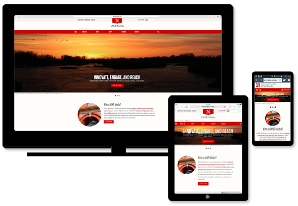
A responsive web design is mobile friendly. It dynamically adapts content to fit the size and orientation of mobile and desktop screens to provide the best user experience.
A mobile-friendly site satisfies the following conditions when viewed on a mobile device.
- Content can be viewed without having to scroll horizontally
- Text can be read comfortably without having to pinch and zoom to adjust the size
- Slideshow animations and videos play
- Clickable areas are large enough for the average human finger to hit
- Images and videos scale to fit the screen size and orientation
- Users can find the same content on mobile as they can on the desktop view
Although the UNL.edu framework was designed to be responsive, that doesn't mean any code you add in the UNLcms HTML editor will be responsive. For your site to remain mobile-friendly, use a responsive grid layout with breakpoints for displaying content in columns and responsive tables for tabulated data.
Adding responsive content
- A responsive layout can be obtained by using grids with breakpoints. Read more about how to setup grids in UNLcms.
- Responsive tables can be created in UNLcms using the Responsive Table Generator Tool.
TestING Your Site
The best way to test your site's mobile-friendliness is to view it on as many mobile devices and in as many browsers as possible. If you don't have a variety of devices available for testing, you can perform a general test in your desktop browser. Testing in your desktop browser won't show you exactly how your site will look on mobile but it will show you how it behaves.
To test your site, click on the lower right corner of your browser and drag it to the left until your browser is the smallest width possible. Watch how the content and layout changes.
- Are images or text cut off?
- Is the font too small to read?
- Are columns, images or text unexpectedly overlapping each?
- Check your site on Responsinator